Thank you for taking a look at my digital portfolio! I have arranged my work in chronological order so that the pieces from my AS Level are at the top of my blog, and it runs all the way through to my most recent A2 Level pieces which are at the bottom.
Wednesday, 20 January 2016
Typography Experiments
This
is part of my typography study for a section of my first AS Level
project, where I experimented with multiple techniques in order to create a
range of different fonts, and learn the fundamentals of typography. This
includes vocabulary such as tracking/kerning, serif/sans serif etc. In this
piece, I have used graphite pencils to create the designs, and have mounted my
designs on to coloured card.
Dimensions:
A4 sketchbook page
Wispa™ Bar
This is a marker pen rendered drawing
I have created of a Wispa™ bar,
which I did to experiment with new techniques and develop my marker pen
rendering skill. The text has been marker pen rendered, cut out and mounted
onto purple card. I have then added shadows and highlights to make the bar look
3D and as if the "wrapper" is glistening. The shading had been done
with purple coloured pencil, and the highlights have been done sued white
pencil and white acrylic paint.
Dimensions: 297mm x
210mm
Development of Book Cover
These are development pages for my first AS Level project, where we were asked to create a book cover for a novel of our choice. These pages show some of my earlier designs which I refined and developed, but were still unsuccessful for what I was trying to achieve.
Dimensions of pages: 210mm x 297mm
Final Book Cover Design
This is my final book cover design for my first AS Level project. I have used techniques from my chosen designer, Fernando Reza, such as block colours and simplistic design. In my design I was able to successfully portray the events of the novel without revealing too much of the plot, and set the atmosphere of the book.
Dimensions: 291mm x 120mm
Quentin Blake Artist Study
This is a copy of a Quentin Blake piece which I have used in my second AS Level project. I have copied one of his illustrations of Fantastic Mr Fox, which uses clear examples of gestural drawing. To create this piece I sketched a copy of the original design, added watercolour, then used black ink for the drawn details.
Dimensions: 210mm x 232mm
Jamie Hewlett Artist Study
This is an artist study of Jamie Hewlett, and this is my copy of one of his watercolour pieces. I decided to recreate this piece as opposed to some of his more well known pieces, as it was still a well known character (Murdoc from The Gorillaz), but the style of the design was closer to what I was hoping to include in my final piece. To create this piece, I sketched the a copy of the original, added colour by using watercolours, the used black ink to add the drawn details.
Dimensions: 203mm x 272mm
Album Artwork Development
These are developmental pages from my second AS Level project, and are of the process of creating a developing album artwork. In these pages you can see my initial ideas, and the development of the main design of my final piece.
Dimensions of pages: 297mm x 420mm
Album Artwork
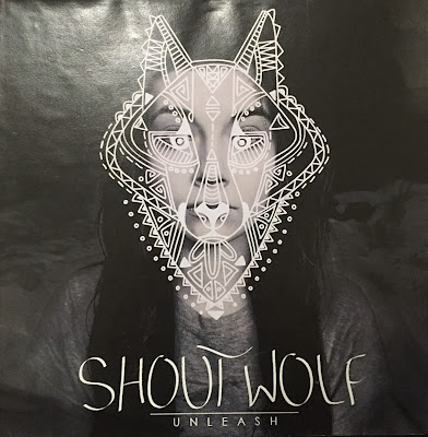
This is my final design for the front, inside and back of a vinyl cover for my second AS Level project. I was able to successfully create album artwork which suite my target audience of "indie" teenagers, and was able to incorporate the technique of photo manipulation which i based my project on - I did this my drawing the wolf design over my own face. For this piece, I used Adobe Photoshop to edit the photograph, and Adobe Illustrator to produce the wolf design and arrange the design. I then produced a full sized prototype, which you can see photographed.
Dimensions: 284mm x 284mm
Joan Cornella Artist Study
This is a recreation of part of one of Joan Cornella's pieces which I included in my AS Level exam piece. The style of the design was suited to my target market for this project, however, the content was not - as appropriately seen in my copy. To create this piece, I sketched out the copy and then used acrylic paint to add colour.
Dimensions: 270mm x 125mm
Wirrow Artist Information and Analysis
These are a couple of pages of research about an artist called Wirrow, whom I used in my AS Level exam project. My research included information about the artist, the techniques he uses, and an analysis of one of pieces. I did this in order to effectively copy some of his work later in my project.
Dimensions of pages: 210mm x 297mm
Wirrow Artist Study
This is a recreation of one of Wirrow's pieces. As a lot of his work uses negative colours, I had to origianly create the piece in positive colours and edit the image after. I have included both images in order to show how I managed to achieve the effect. To create this piece, I blue highlighter, black ink and black chalk on tea stained paper, and then made the image negative.
Dimensions: 210mm x 297mm
Helen Musselwhite Artist Study
This is an artist study into the work on Helen Musselwhite, who used the media of paper cutting to produce her designs. I used this technique throughout my project, and eventually in my finally piece. I used card and a craft knife to create multiple layers of the image, which I later stuck together using stryofoam for the base and supports, and a hot glue gun to secure all the pieces in place. The template for the house and the background trees were cut out using 2D Design, while the rest was hand drawn and cut out.
Dimensions: 420mm x 420mm x 600mm
1930s Magazine Drawing
This is part of my A2 Level project which revolves around and explores vintage and retro design. This piece is a copy of a drawing used in a 1930s fashion magazine, and I recreated this in order to investigate the way women were protrayed at this time, and made comparison to today. To create this piece I used graphite pencils to sketch, and then coloured pencils to add the colour details.
Dimentions: 70mm x 265mm
Propaganda poster
As part of the 1940s section of my A2 project, I have recreated an original 1940s propaganda poster. I did this in order to study and learn the techniques of one of the most popular vintage design styles used in modern design. For this piece, I created half using Adobe Illustrator (left) as this is how we produce this style of design today, and I painted the other half using acrylic (right) as this is how it would have been originally produced. The design has been mounted onto wooden board.
Dimensions: 594mm x 841mm
1950s Diner Sign
This is a digital drawing of a diner sign which I produced as a title for the 1950s section of my A2 Level project. I used a photograph of a diner sign as a template for my own version, and used different tools and techniques in Adobe Illustrator in order to create the perspective of the sign.
Dimensions: 200mm x 297mm
Batman
This is a copy of the character Batman from an original 1950s comic book. I created this copy in order to study comic book drawing styles, as this is something I am hoping to adapt and use in my final piece. I produced this image by first hand drawing a copy of the original comic book cover, then scanned this image into the computer and produced a digital version using Adobe Illustrator.
Dimensions: 255mm x 250mm
Conrad Crispin Jones Artist Study
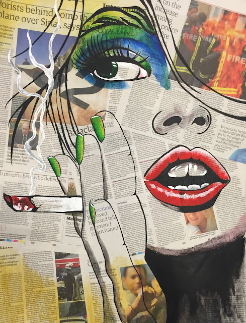
This is the most recent artist study of my A2 project. This is a copy of one of Conrad Crispin Jones' pieces, and is a study into how the techniques of pop art, in this case the bright colours and characters, can be adapted and used to create a new design. I have used acrylic and watercolour paint, and have painted onto newspaper which has been mounted onto card.
Dimensions: A2 (420mm x 594mm)
Subscribe to:
Comments (Atom)


